A NEW ERA FOR AENAON
6 June 2025
AENAON’S PAST AND PRESENT THROUGH A GLIMPSE
The Karoumpalis family has been ac ve in olive oil produc on since 1960, a me when human hands did more work than machines. Back then, a meaningful and pioneering step was taken: the founding of the first classic olive oil press facility. This marked the beginning of a new era in the produc on of one of nature’s most precious gifts: olive oil.
Today, the fourth genera on of the family runs the business. Equipped with experience, passionand a drive for continuous improvement, Karoumpalis S.A. has redesigned the packaging of its products, responding to modern market demands, while also enhancing its overall image and quality.
THE RE-DESIGN PROCESS
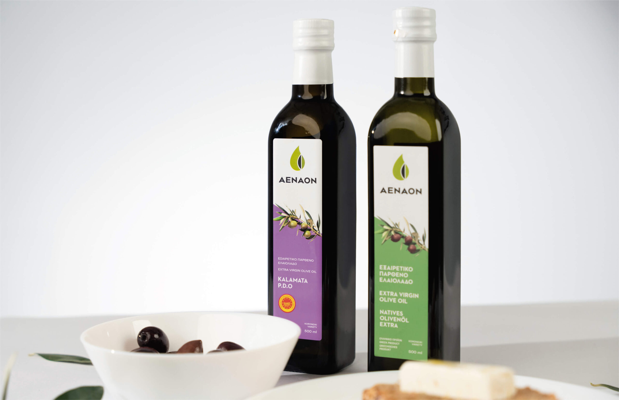
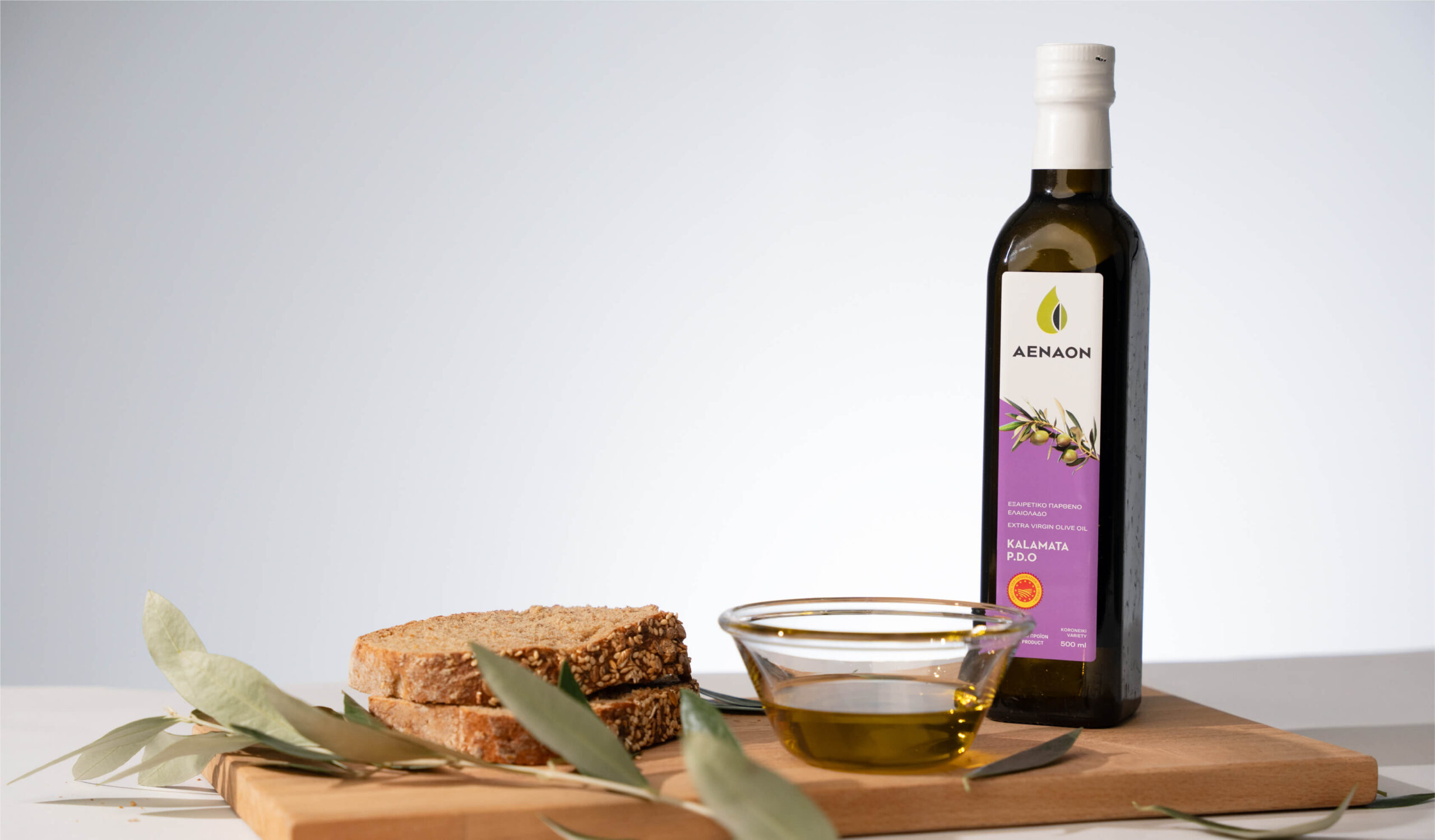
The goal of the redesign was clear: to transition from a harsh and bold aesthetics to a friendly and earthly one. The AENAON products are deeply connected with the earth, nature and the soil of Greece, especially that of Kalamata. Therefore, the new packaging had to respect and harmonize with these fundamental elements.
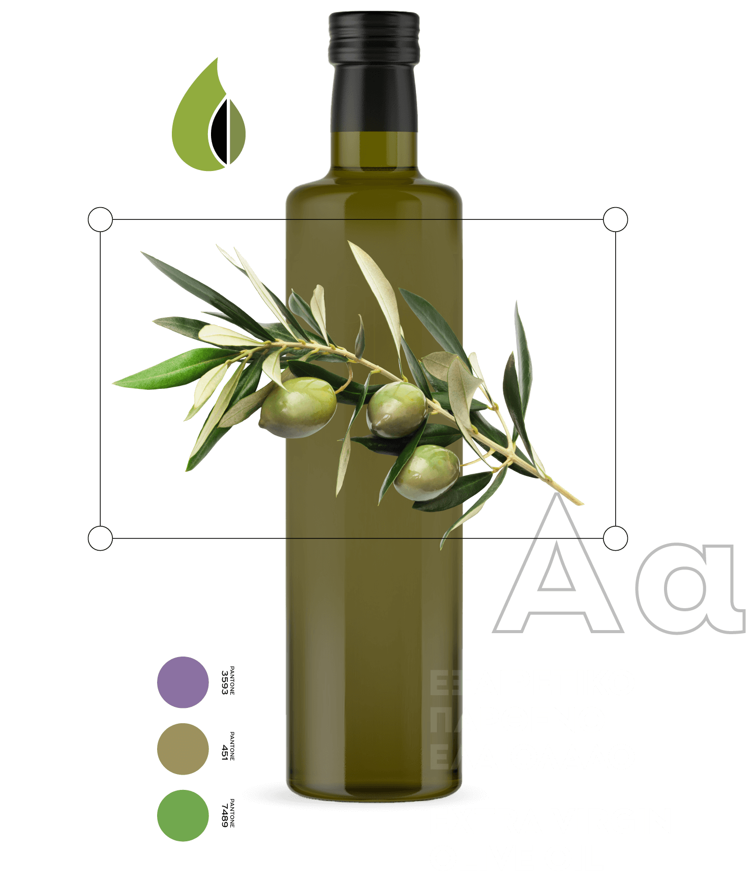
The logo and the font were retained, but refined. The typography, originally inspired by Ancient Greek characters, was modernized, while the logo mark took on a more contemporary and robust form, symbolizing the brand’s con nuous desire for progress.
The previous intense and contrasting color palette was replaced with earthy and natural tones, representing AENAON’s relationship with the Greek land, soil and olive trees. The olive branch was kept as a timeless and classic element, completing the new look with a respectful nod to tradition.
TODAY
AENAON now presents its new image through renewed packaging that reflects a more human and authentic connection with the consumer.
In today’s world, where a balanced and natural diet is increasingly important, AENAON’s products are here to meet that need. This packaging redesign is a conscious step in that direction and a successful outcome that bridges the past with the present.